
We spent the bank holiday weekend painting the garden fence.
I say we. It’s not easy painting a fence with one arm in a sling… so booyaa did the vast majority of the work. I don’t know where he finds the energy, but I’m grateful for it nonetheless.
We’ve been putting up with a very un-boolou garden for a year, and this year we’ve decided that it’s going to get done. Partly it stems from when we were painting the dining room and we took it in turns to keep Betsy entertained in the garden. Sitting out in the sunshine next to the small flower bed we created last year was really very pleasant and we’d both love to use the garden more than we do (which is barely at all). Between the uneven surface, the skiddy gravel, the trip hazard manhole covers, the slope upwards to the back, and the overhanging trees full of shade and pigeons*… well, it’s not a very welcoming space.
We now have a quote for landscaping that’s affordable, and are pencilled in for the last week of June for the work to happen. Between now and then we need to clear out the junk that’s accumulated at the back of the garden, paint the fence, pot up the plants we’ve not long since put in the ground (hugely nervous about that) and grow some annuals to fill out what will be about ten times our current growing space.
So this weekend we tackled the fence. I faffed about choosing the colour using the Cuprinol website colour tester. My first choice was ash black, which mimics the scorched weatherboard of the local (well, Suffolk) architecture, but decided it would be too strong a look for our small garden, and certainly wouldn’t look very urban Victorian terrace. I couldn’t possibly go ‘Forest Green’ or ‘Conker’ or whatever those fake-natural dark shades are, so I chose “Muted Clay” which looked modern and fresh, and a mid-tone greige (that’s grey-beige to the non-initiated). I hoped the ugly concrete fence posts would blend in a little, as they really stand out against the orangey-brown colour we started with and guessed that the green of the plants would stand out nicely against a light, neutral colour.
The weather was forecast to be dry but cloudy, so we thought we’d get the whole fence painted once round. We were even optimistic enough to think we might get both coats done. Ha ha ha. How naive we were. Rain stopped play after 3 panels on the first coat. It dried up again later and while I was cooking dinner booyaa went and stormed through to the end of one side. We got one coat on half of the fence done by the end of the day.
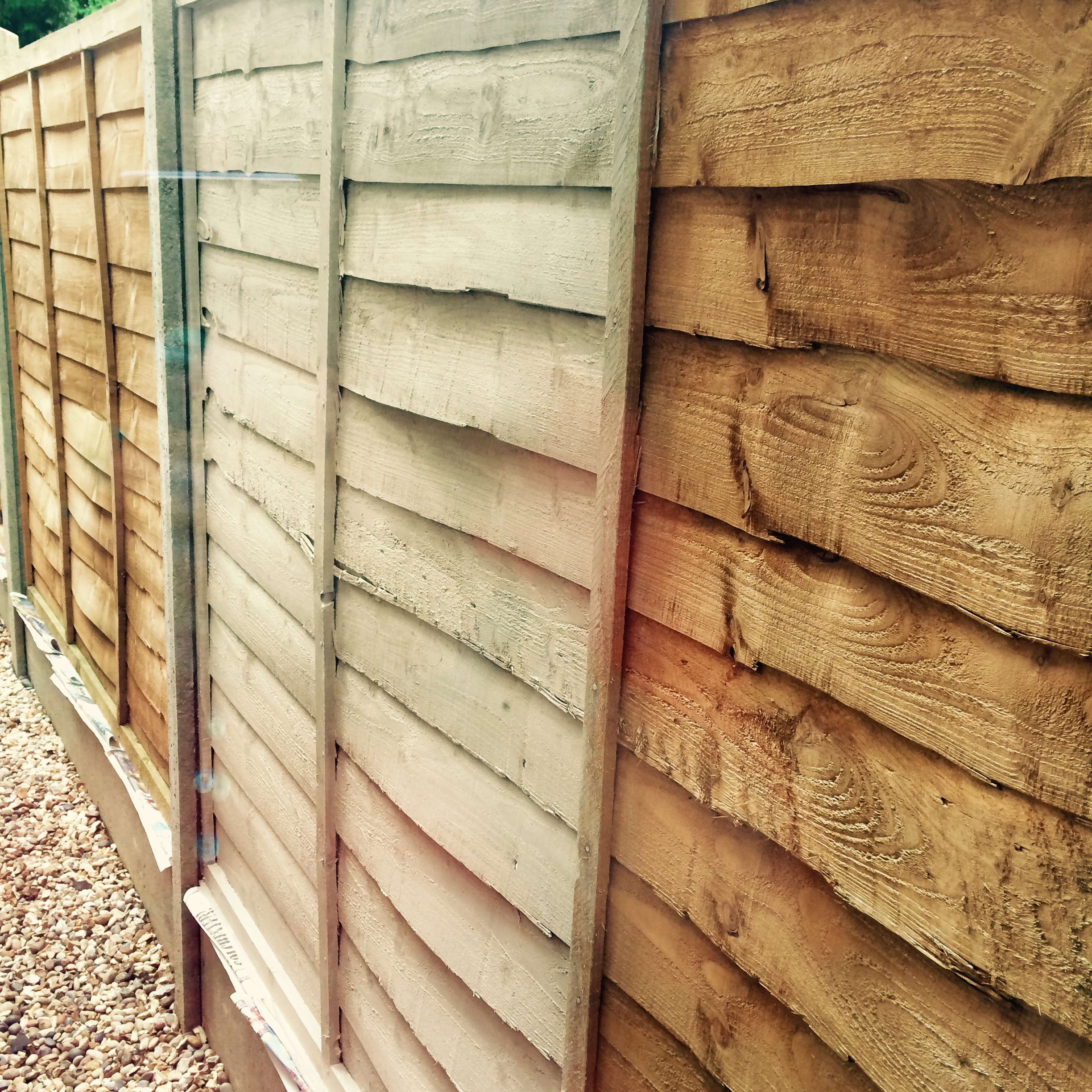
Orange-greige side-by-side comparison
We think the fence was all replaced at the same time, but because it’s weathered differently in places the paint has changed the colour in a subtly different way too. The gate at the back, which is a better quality finish than the fence, has a much stronger colour. The barely touched by sun panels along the side return have changed the least. I mean, they’re not orange any more, but they’re not as strongly coloured as other parts of the fence. After just one coat the fence looked like it had had all the colour bleached out of it. It was a ghost fence.
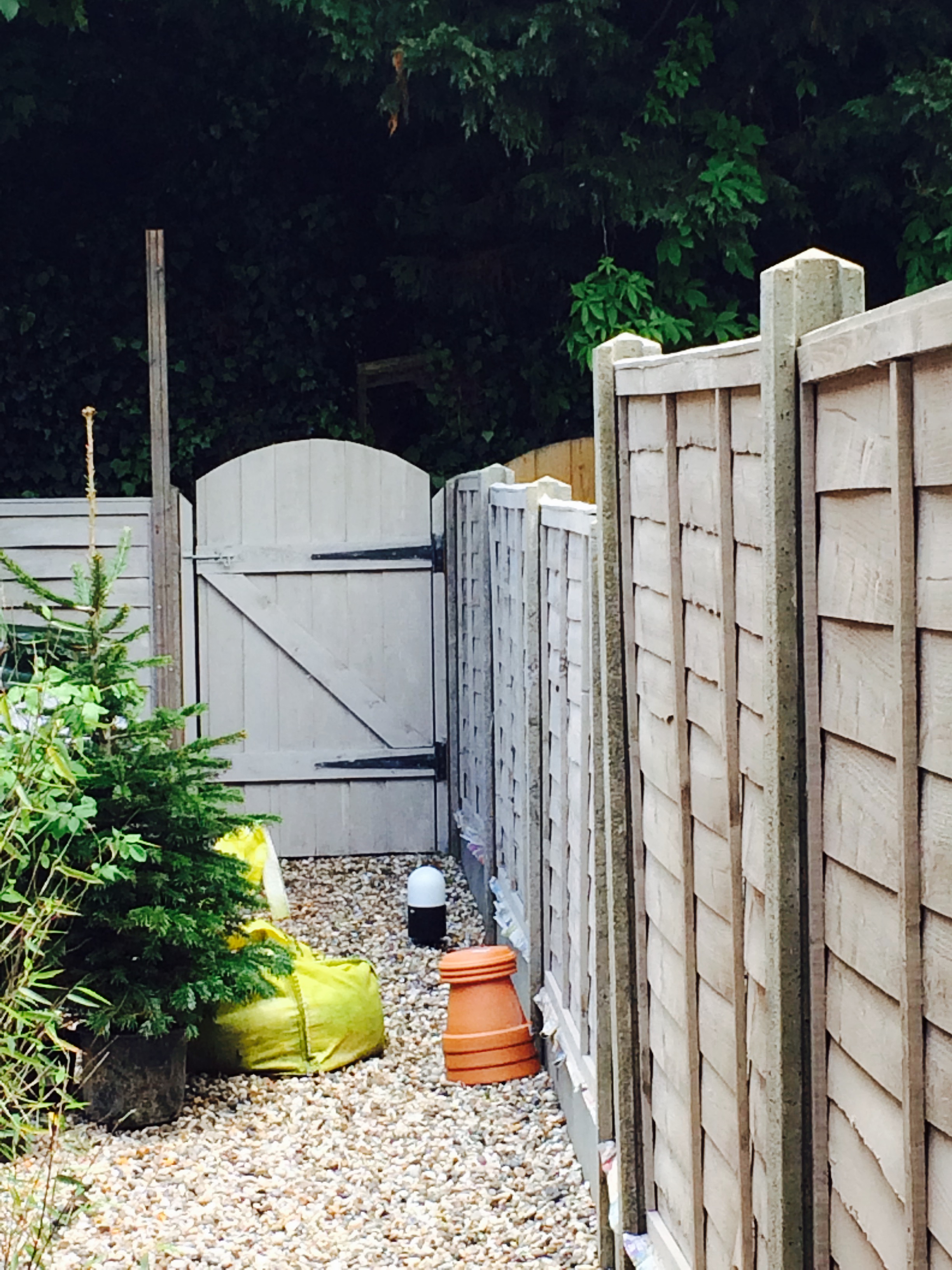
Different finish on different wood
Thank heavens for bank holidays, eh? Monday was forecast cloudy with possible showers in the afternoon. We got started after breakfast and finished the first coat on the rest of the fence and started on the second coat by early afternoon. We ran out of paint halfway through the second coat. With no more of our chosen colour in the local Wilko’s, and neither of us fancying a trip to B&Q on a bank holiday Monday, we’re hoping Wilko’s will have more in stock during the week so we can finish off next weekend. But for now, we’ve re-Betsy-proofed the garden and called it a day.
Where the second coat has dried it still looks like we’ve got a ghost fence. The plants show up really well against it, both of us are pleased to see the back of the orangey-brown colour we had before, and it achieves the aim of drowning out the otherwise really noticeable concrete fence posts. The fresh green plants look great against it, and I can’t wait for something blue to flower because I think that’s going to look really vibrant. But on its own it’s a bit meh. Lucky we’ll have a garden full of cosmos and cornflowers in a couple of months.
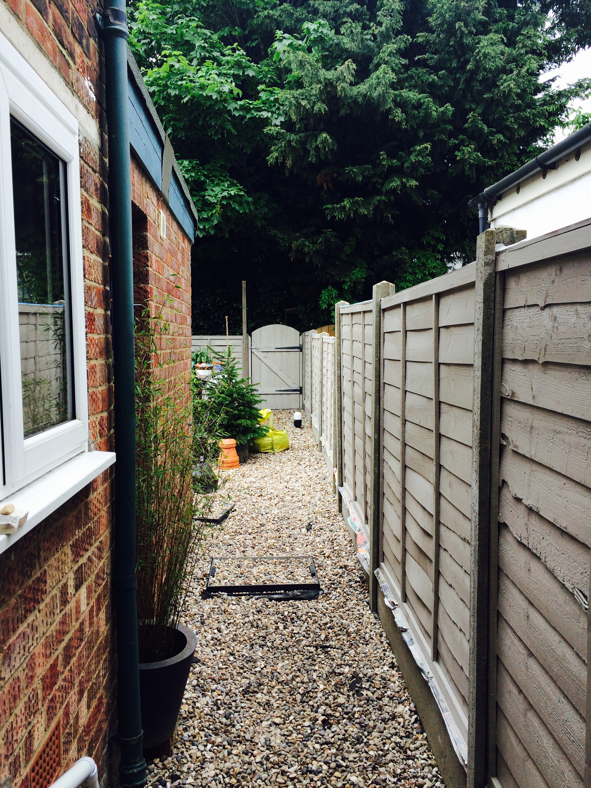
The Ghost Fence in all its glory
*Dad says they’re collared doves. They look like what most of us heathens think of as wood pigeons. They’re big, noisy things, that’s the important point.