We’ve got a new kitchen!
We haven’t bought a new kitchen. We’ve upcycled what we had.
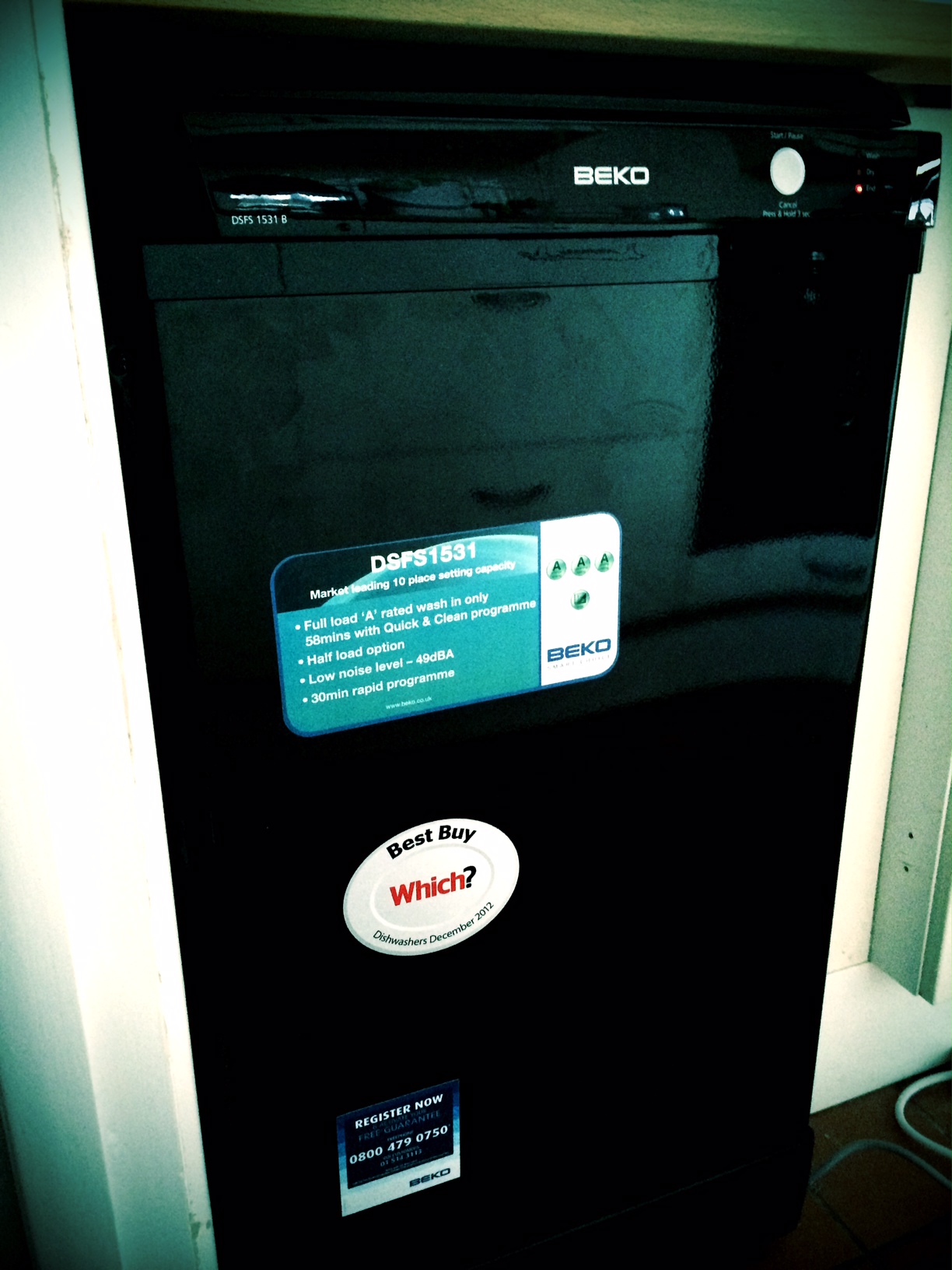
We renovated one worktop and installed one new worktop which we needed in order to fit the dishwasher. Then we had the cupboard doors painted and added new handles.
The kitchen is from Ikea, I believe. A bit of detective work shows up Ikea stickers here and there and I recognised the handles. So it’s not going to last forever. I think Ikea is brilliant at getting you a well-furnished, good-looking home on a tight budget. Most of their cheaper stuff doesn’t last and the more substantial stuff fails on the surfaces. Things tarnish and scuff easily. At least, that’s my experience. This kitchen is sturdy enough. The soft-close mechanisms have failed. The paint finish has worn or cracked in a number of places. What looks like steam damage had made the cabinet above the cooker swell. One of the drawers looked to have swollen in a similar way, making the edge all wavy.
So, we sanded off the swollen bits, took off the very boring handles and polyfilla-ed the resulting holes. There’s a small cabinet without a door where the microwave sits, so we filled in the spare holes there, too. It looks much neater.
Then Mr joiner-painter came and did the painting. The original colour was a light cream, and the top cabinets have been repainted in a warm white. That needed one coat of primer and two top coats. The bottom cupboards were painted dark grey so that took two coats of primer and two top coats.
Details
Top cabinets are painted in Farrow and Ball Wimborne White.
Lower cabinets are painted in Farrow and Ball Down Pipe.
Cupboard handles are large ceramic knobs in Lime Zest from theseplease.co.uk
Cost
We could have had new doors made fairly cheaply, so was it worth it to do it this way?
Paint. There’s still plenty of primer and paint left over, and it will get used on other projects. It’s already earmarked and was planned in advance to keep costs down. But still, it was £74 for the two cans of primer and two cans of paint.
Mr joiner-painter charged us £140 for a day and a half of work.
The new handles cost £33 (we needed 11).
The new worktop, joinery and oil all together came to £220.
So, not quite a new kitchen but it certainly looks like it, and all for under £470.
Verdict
The colour of the lower cabinets is just stunning. On the website the paint colour looks like a darkish, dull grey. In real life it’s a beautiful, rich colour. It changes depending on the light — I’m finding this is a speciality of F&B paints — from a greenish grey to a deep bluish grey to almost black. The top cabinets are a warm white colour. They don’t change as much as the lower cupboards, but the overall effect is a clean, bright not-quite-white.
This is the kitchen on the day we moved in.
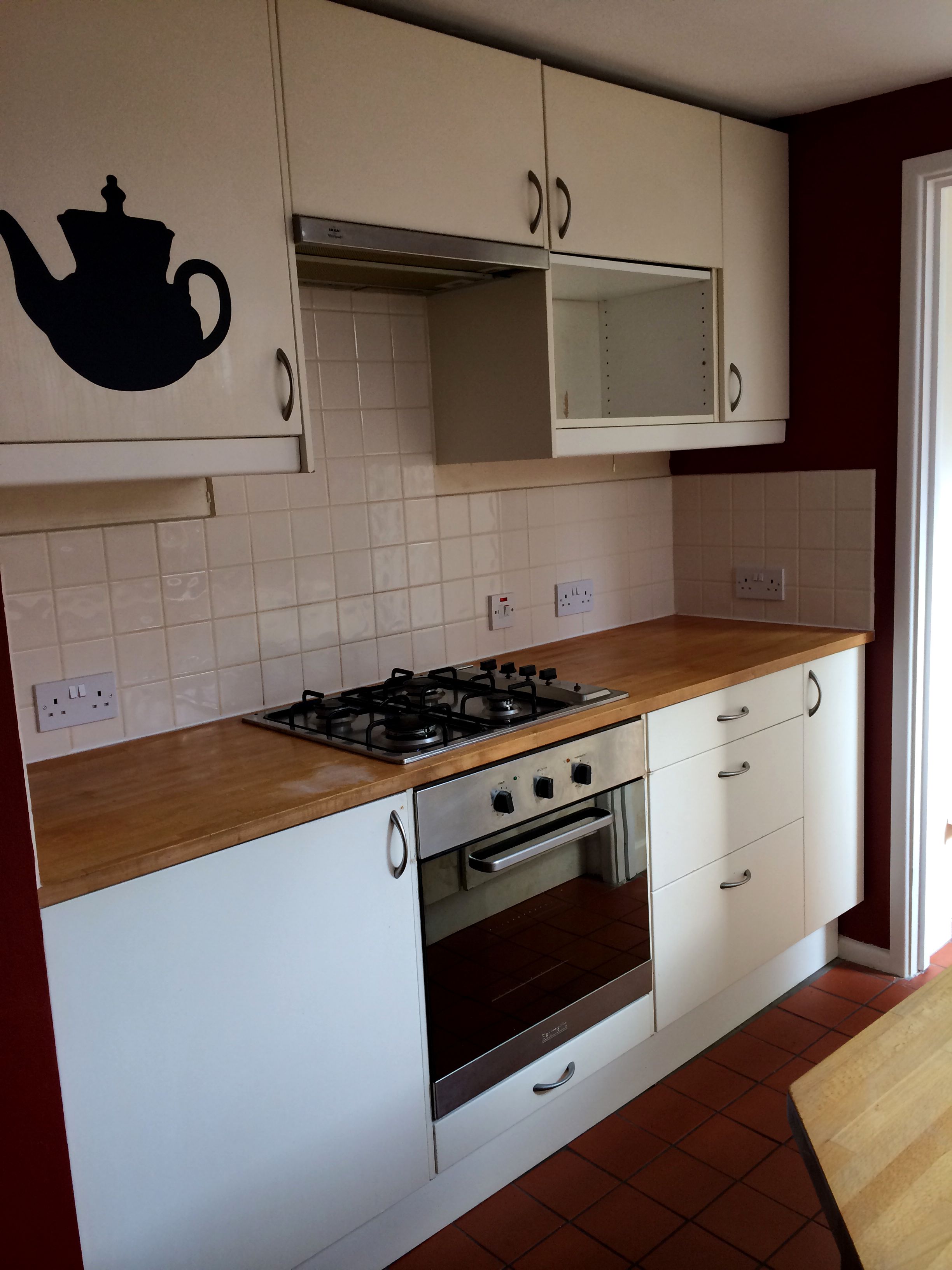
Day 0: kitchen
This is the kitchen this morning (I was going to wait until the kitchen was clean and tidy, and the shelf next to the microwave needs putting back…. but you might never get a photo if I wait until it’s perfect.)
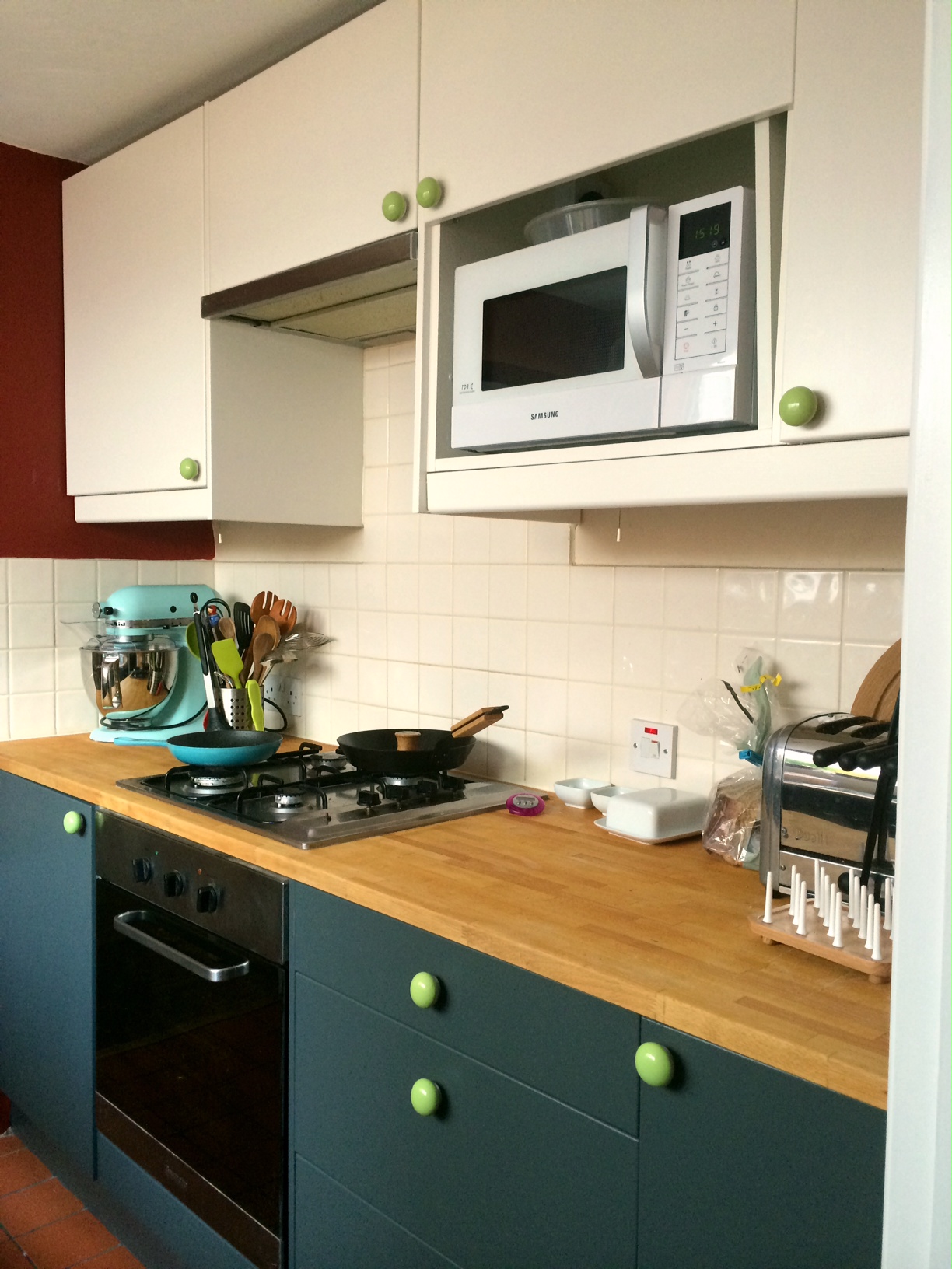
You’d think we’d had a new kitchen fitted.
Close up of the drawers with their new shiny handles.
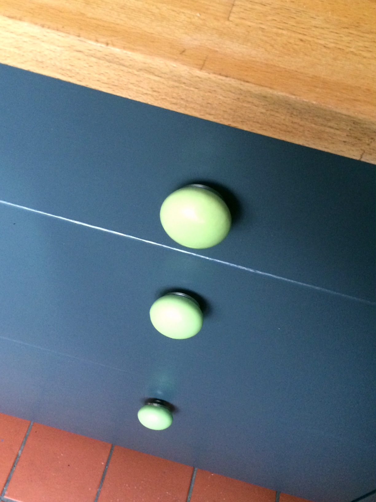
drawers smoothed, painted and sporting their new handles