painting

fencing round 2

There was a problem with the blog hosting and I couldn’t create new posts. It was so far down our priority list to get it fixed that it’s taken us the best part of a year. Anyway. We’re back now. I’ll update you on all the super exciting* stuff over the next couple of weeks.
*May not be actually super exciting.

Most of you are aware that the neighbours on one side can be somewhat obnoxious. The 20-year-old son hangs out in the garden with his friends for very long periods of time (like 11am to 11pm) and their conversations are loud and frequently offensive. They all smoke and our garden reeks of weed. So, we’ve had numerous run-ins with the mother, who is very apologetic but ultimately does nothing about it. After our last, and biggest spat, at the end of summer last year, she put up some reed screening. She stapled it to the fence then added delightful garlands on top. *cough*

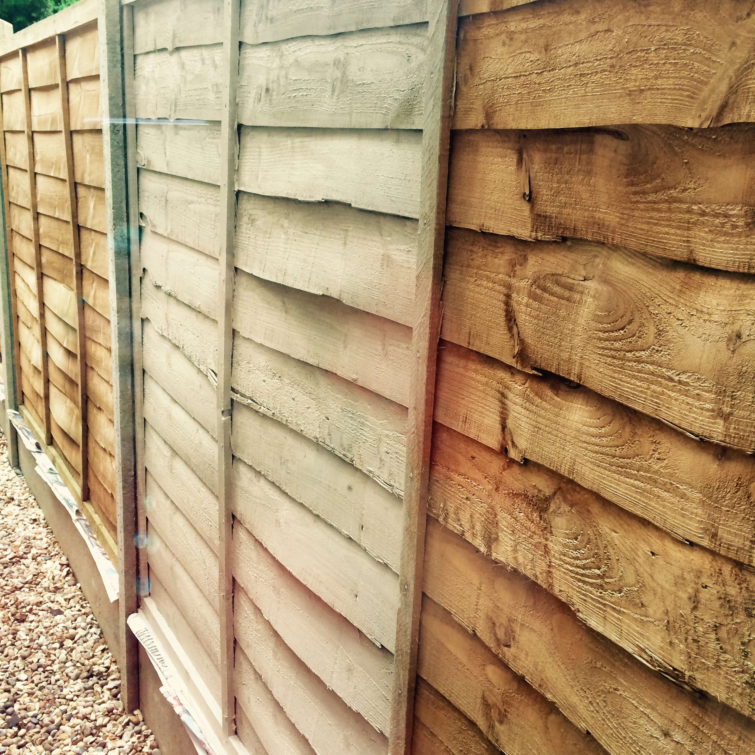
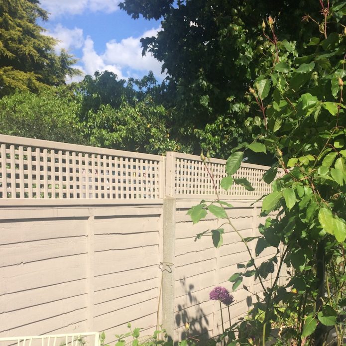
It looked like this from our side:

marie-fence-screen

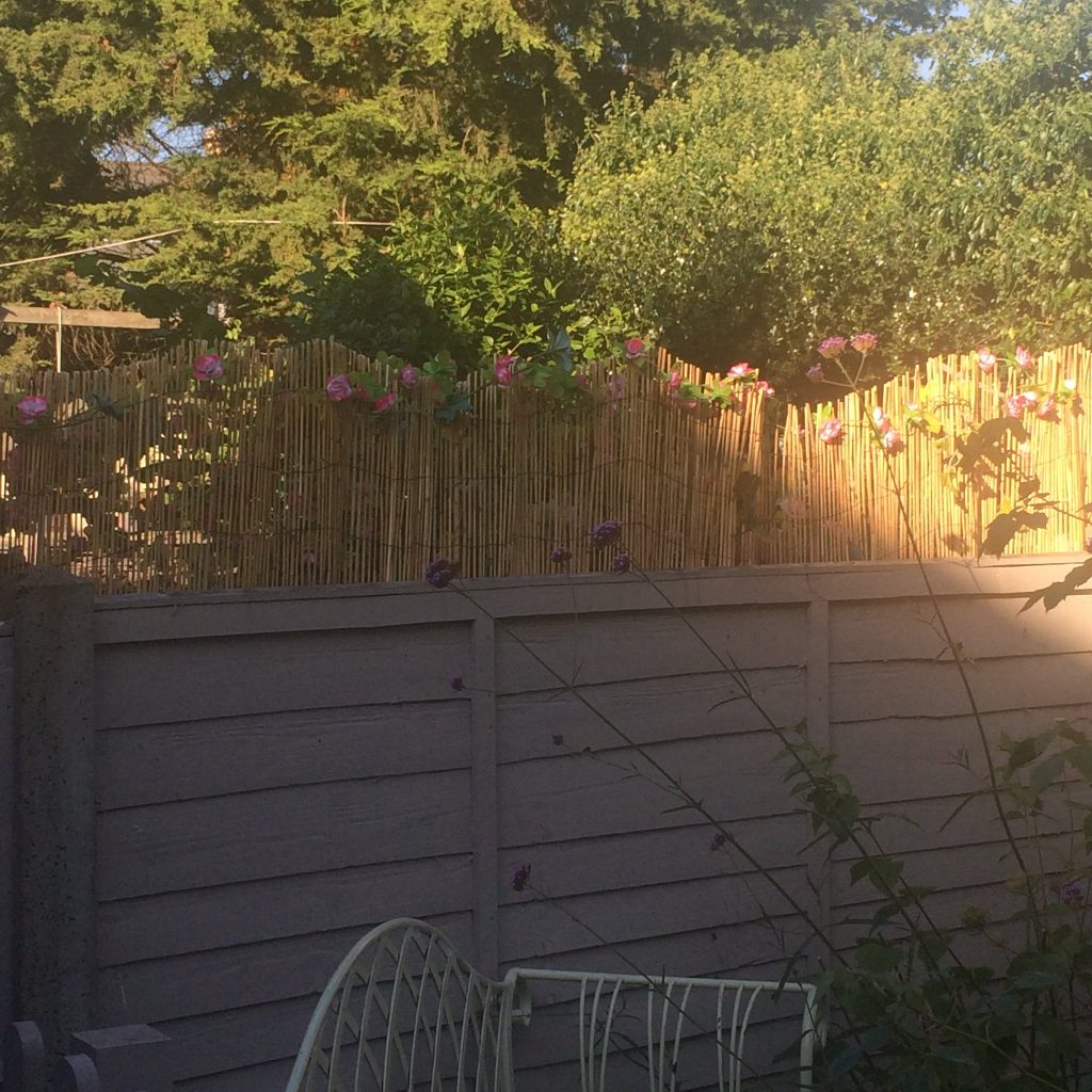
neighbour’s tiki bar screening

I really hoped it was a temporary measure. She stapled ivy and sunflowers to her side of the fence, too. I thought maybe she was having a party. When it became clear she was doing it in an attempt to ease the situation with her son, well, I was pretty mad. It looks awful and isn’t going to help. Stupid idea.

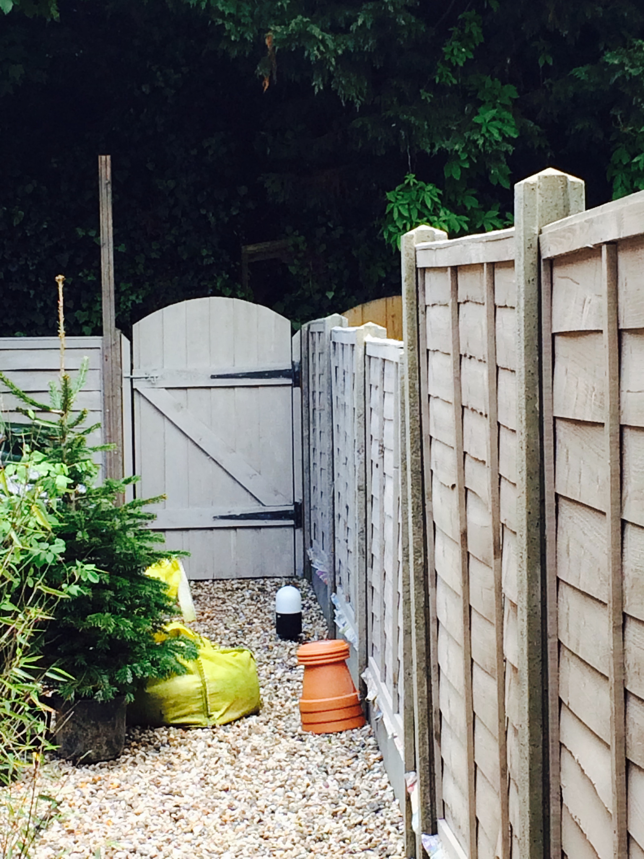
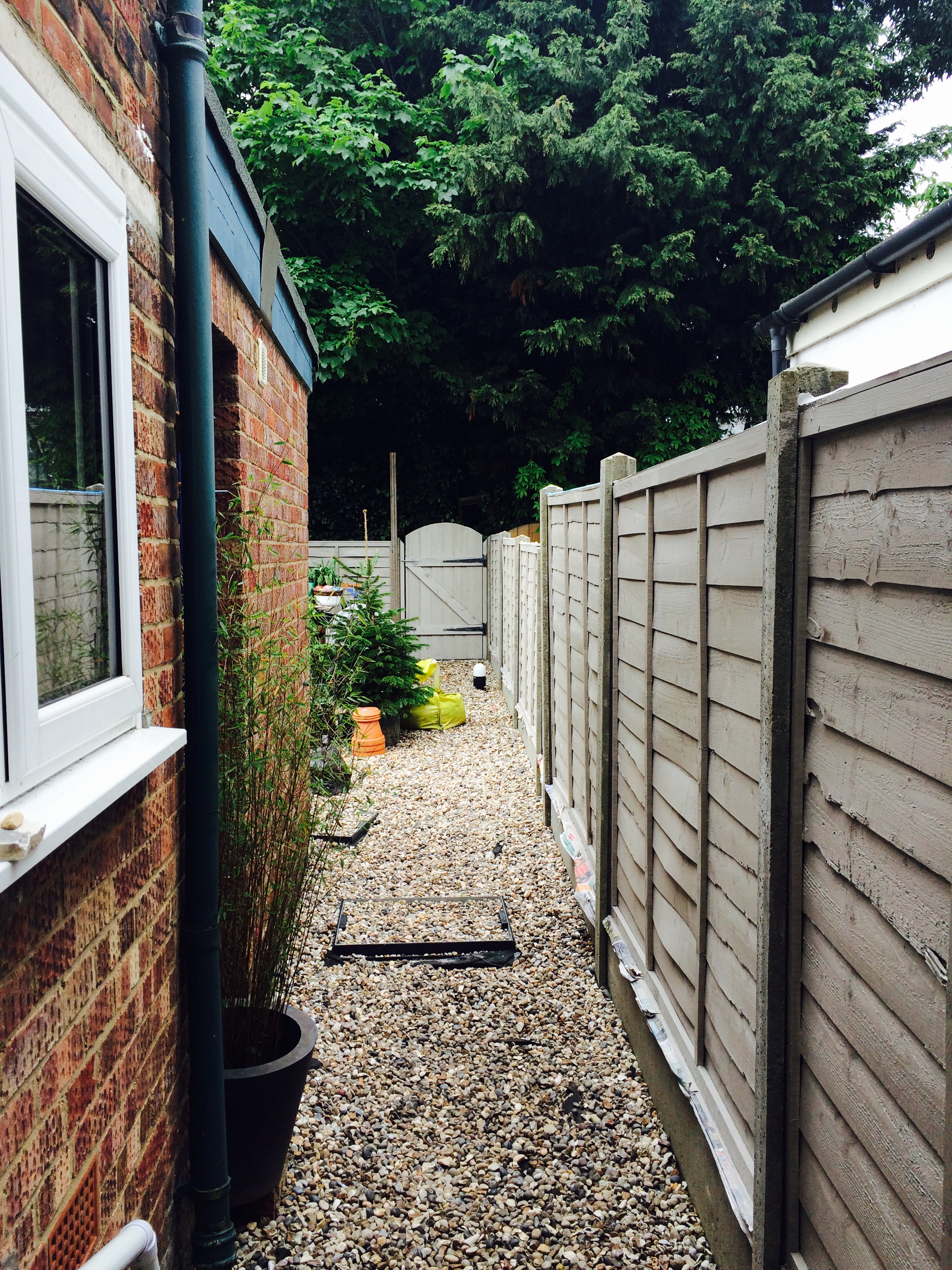
Fast-forward to January this year. It occurred to me that we could add a trellis to the top of our fence instead. It wouldn’t cover up all her screening, but it would blot some of it out and would mean the honeysuckle would have somewhere to cling to. I did some research and we bought some sturdy trellis (not the cheap stuff you get from Wilko) and some special brackets which attach to the fence and fix the trellis securely against our relentless winds.

So, everything ordered and expected to arrive by Easter, we were ready to make this happen.

Then the brackets didn’t arrive.

Ugh.

I did some fighting with the supplier and told him his communication was terrible and he shouldn’t promise a 2-3 day despatch turnaround if he can’t fulfil it.

In the meantime we painted the trellises to match the fence. I say we. Other than sourcing the trellis and brackets, and occasionally providing consultancy, I did no actual physical graft on this project. Mark did all the work.

Then, huzzah! the brackets arrived. We tested them out and discovered that while the brackets fit on the fence your average trellis is narrower, so it wobbles about in the bracket. Also, and this is entirely my fault, our fences are imperial while the trellis is metric. So there was a 3mm gap at each end too. What a kerfuffle. Off to the local building merchants to get some wood batons to use as spacers.

We used my favourite primer, Zinsser 1-2-3, to prime the galvanised brackets. Galvanised metal doesn’t take ordinary paint. You need a primer that will stick to it. Do your research if you intend to paint outdoor metal. (Or just buy a pot of Zinsser 1-2-3 because it will prime ANYTHING.) Then a coat of Cuprinol to match the fence/trellis.

Next, slide up the fence panel and prop it on some bricks while you screw everything in place. Gentle rubber mallet to bash them back down again (with the metal bracket on the fence, some of them were really quite tight) and hey presto!

Now to plant some annual climbers and another honeysuckle along the left fence, and tie in the existing honeysuckle on the right.

new-trellis

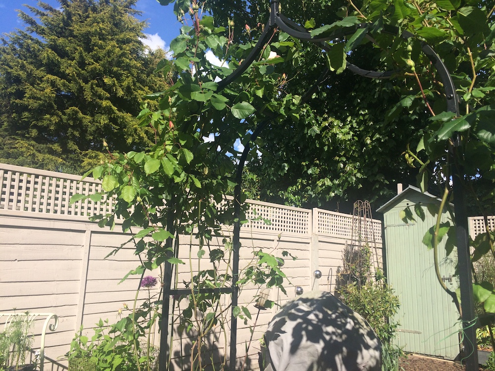
I think that’s better than the tiki bar screening, don’t you?


Things you need to know about fences.

There’s a well-known thing about how to work out which fence is yours and which is your neighbours depending which way the fence faces. Apparently, this isn’t accurate. Older houses often no longer have the boundaries in their original places when walls have been moved, or neighbours have made informal agreements. So, don’t take it for granted. The upshot is: if you want to change your fence, other than paint your side of it, you need to ask your neighbours. Just in case.

There are rules about the maximum height of any permanent structure on domestic boundaries. That means a wall or fence can only go up to 6 feet, but hedges and trees – ridiculously not considered permanent structures – have no such limits. If your fence/wall is roadside check with the council. In some cases, I think if there’s a possibility it might block drivers’ views of a turning, the height restriction is 5ft.

sitting on the fence

We spent the bank holiday weekend painting the garden fence.

I say we. It’s not easy painting a fence with one arm in a sling… so booyaa did the vast majority of the work. I don’t know where he finds the energy, but I’m grateful for it nonetheless.

We’ve been putting up with a very un-boolou garden for a year, and this year we’ve decided that it’s going to get done. Partly it stems from when we were painting the dining room and we took it in turns to keep Betsy entertained in the garden. Sitting out in the sunshine next to the small flower bed we created last year was really very pleasant and we’d both love to use the garden more than we do (which is barely at all). Between the uneven surface, the skiddy gravel, the trip hazard manhole covers, the slope upwards to the back, and the overhanging trees full of shade and pigeons*… well, it’s not a very welcoming space.

We now have a quote for landscaping that’s affordable, and are pencilled in for the last week of June for the work to happen. Between now and then we need to clear out the junk that’s accumulated at the back of the garden, paint the fence, pot up the plants we’ve not long since put in the ground (hugely nervous about that) and grow some annuals to fill out what will be about ten times our current growing space.

So this weekend we tackled the fence. I faffed about choosing the colour using the Cuprinol website colour tester. My first choice was ash black, which mimics the scorched weatherboard of the local (well, Suffolk) architecture, but decided it would be too strong a look for our small garden, and certainly wouldn’t look very urban Victorian terrace. I couldn’t possibly go ‘Forest Green’ or ‘Conker’ or whatever those fake-natural dark shades are, so I chose “Muted Clay” which looked modern and fresh, and a mid-tone greige (that’s grey-beige to the non-initiated). I hoped the ugly concrete fence posts would blend in a little, as they really stand out against the orangey-brown colour we started with and guessed that the green of the plants would stand out nicely against a light, neutral colour.

The weather was forecast to be dry but cloudy, so we thought we’d get the whole fence painted once round. We were even optimistic enough to think we might get both coats done. Ha ha ha. How naive we were. Rain stopped play after 3 panels on the first coat. It dried up again later and while I was cooking dinner booyaa went and stormed through to the end of one side. We got one coat on half of the fence done by the end of the day.

Orange-greige side-by-side comparison

Orange-greige side-by-side comparison

We think the fence was all replaced at the same time, but because it’s weathered differently in places the paint has changed the colour in a subtly different way too. The gate at the back, which is a better quality finish than the fence, has a much stronger colour. The barely touched by sun panels along the side return have changed the least. I mean, they’re not orange any more, but they’re not as strongly coloured as other parts of the fence. After just one coat the fence looked like it had had all the colour bleached out of it. It was a ghost fence.

Shades of greige

Different finish on different wood

Thank heavens for bank holidays, eh? Monday was forecast cloudy with possible showers in the afternoon. We got started after breakfast and finished the first coat on the rest of the fence and started on the second coat by early afternoon. We ran out of paint halfway through the second coat. With no more of our chosen colour in the local Wilko’s, and neither of us fancying a trip to B&Q on a bank holiday Monday, we’re hoping Wilko’s will have more in stock during the week so we can finish off next weekend. But for now, we’ve re-Betsy-proofed the garden and called it a day.

Where the second coat has dried it still looks like we’ve got a ghost fence. The plants show up really well against it, both of us are pleased to see the back of the orangey-brown colour we had before, and it achieves the aim of drowning out the otherwise really noticeable concrete fence posts. The fresh green plants look great against it, and I can’t wait for something blue to flower because I think that’s going to look really vibrant. But on its own it’s a bit meh. Lucky we’ll have a garden full of cosmos and cornflowers in a couple of months.

Side return

The Ghost Fence in all its glory

*Dad says they’re collared doves. They look like what most of us heathens think of as wood pigeons. They’re big, noisy things, that’s the important point.

50 shades of grey

Oh boy. This was finished months ago but I haven’t revisited the blog to update it.

The living room is a small room with one sash window which gets no direct sunlight all day and the front door which opens directly from the street. There’s a boarded-up fireplace which we intend to open up when we can afford to get the chimneys repaired and install a woodburner. One alcove to the side of the chimney breast has a low-level built-in cupboard and three shelves. The room was painted pale blue when we moved in, with woodwork in the usual white. It always felt cold and fairly unwelcoming.

When we were deciding how to decorate in here we had two main concerns. One was the front door sticking out like a sore thumb. See Exhibit A:

Day 0: living room

white door and plasticky frame

The other was that it’s dark and cold all the time. We decided the best way to deal with is was to make it a dark but warm room. We never get sunlight here. A tiny shaft of setting sun comes through the fanlight just before sunset. That’s it. So, after raking through magazines and books (boy is Pinterest helpful here, even if it is a bit of a pain to use these days. Thanks spammers!) we bought some dark paint testers. We both adored the charcoal grey but decided it might be just a bit too dark, and opted for what my mum calls “battleship grey”.

Next was to find a solution for the front door and its shiny whiteness. It’s a new door, with pvc mouldings and a fake wood grain effect. Looks fine from the outside and from a distance, but close up it’s pretty ugly. I found a special (and non-scary) primer which we could then paint an undercoat and eggshell over. It’s designed especially to prime pvc windows and — somewhat bizarrely — block smoke stains from coming through subsequent coats of paint.

So, I picked a week when I had reduced commitments workwise and got stuck in. The room was empty as we’d just had the floor fitted, so a few plastic dust sheets went on the floor and I spent hours fiddling with masking tape, then up and down the step ladder, nervously applying the specialist primer, then an undercoat to the door, window and shelves. The undercoat was so very dark and even after two coats it still looked horrendous. I know that next time I do this I’ll get the primer tinted, too, as that will help.

livingroom-undercoat

special primer plus two coats of undercoat

We painted the ceiling F&B Wimborne White. To look at it you’d probably think it was just white, but I know it looks less harsh than a brilliant white would. I swear I’ll never use ordinary white paint again. Then I finished the woodwork, all of it: door, window, radiator, shelves, cupboard, skirting in F&B Plummett eggshell. Two coats of eggshell went on like a dream, despite our unprofessional approach to painting, and the finish is just beautiful. Smooth as silk.

The walls were done in the same colour, Plummett, in Estate Emulsion, which gives a very flat matt finish. We cut in quite generously with a good quality angled brush then two coats with a roller. There was one patch that needed going over where the first coat went on a bit too thin, but the bulk of the work was done in a day.

Having the walls and all the woodwork in the same colour means we were able to cover up some “irregularities”, like where there was a weird gap in the skirting, the door now blends in and at night seems just like part of the wall. I love that the less broken up space feels tidier, uniform.

livingroom-door-painted

yay for the door blending in

Depending on the time of day the room varies from a mid- to dark-grey. But it’s beautifully rich and has tones of blue and purple in it. Yes, it’s quite dark, but it’s not a room we use much during the day and it really comes into its own in the evenings, with the warm, cosy feel of dark walls.

my corner, being all cosy

my corner, being all cosy

We’ve chosen a few copper accessories and some strong ochre/gold colours around the place. I knitted a cushion including ochre, copper and a teal blue and we’re slowly increasing the colour in the room. Putting pictures on the walls really helped to bring the room together.

I made that!

I made that!

I painted the old hallway shoe cupboard (separate how-to post coming up) in an even darker grey with a bright gold inside, and that’s got a new lease of life since I still can’t quite conscience £280 for the console table I want. Mum and Dad brought me the octagonal table that had been sitting in the spare room with the second tv on it for the past 15 years. It’s now tucked in the corner at my side of the sofa. It’s nice and high to give me plenty of light when I’m knitting. The light was a bit of a find. A copper tube base twisted into a tripod and a plain black shade from John Lewis for a bargainous £40.

old shoe cupboard looking smart in its new clothes

old shoe cupboard looking smart in its new clothes

The sofa was a bit of a push-the-boat-out. It was expensive but it’s lovely. It’s comfy, hardwearing, elegant and has a big gap behind the curved back where Tinker can hide. I knew she’d love it, and indeed she did, sneaking treats and hiding behind the sofa when she visited. Someone managed to not get a photo…

new sofa looking tempting there

new sofa looking welcoming

Still to do: find or make a cosy rug. The chevrons are excellent but it’s not a very easy rug to look after, plus, despite insulating the floor in here, we could do with a warm rug on the floor. I’m seriously considering making one, something like this. I’ve got some yarn to make a pouf-footstool type thing. It’s a rich ochre and will look great next to the greys. Then we need new curtains. We’re going to have a set of curtains covering the door and the window, pretty much wall-to-wall, so it keeps the warmth in during the winter. It’s pretty pricey to get curtains that wide and I’m not up to making something like that, so we’ll have to wait a couple of months before we can do that. In the meantime, we’ve got some lightweight silvery-coloured curtains from Wilko’s for about £20. They don’t do much for the temperature but they do add to the cocoony feel late at night.

We were both somewhat apprehensive about the colour scheme in here. It made sense, but we still weren’t sure it would work. Luckily, we both love it. We’re really proud of the change we’ve made to what was an uninteresting and not very welcoming room. Random visitors (delivery lady, broadband engineer) have commented on how lovely it is. Friends and family have also complimented us on how well it works. It feels great to come in and here and feel the welcoming vibe. And it’s us. I feel very strongly that this house should reflect us and our way of life. I don’t want an identikit of whatever the high street thinks your house should look like. I want it to be different, welcoming and very clearly ours, and I think we’ve achieved it.

kitchens of distinction

We’ve got a new kitchen!

We haven’t bought a new kitchen. We’ve upcycled what we had.

We renovated one worktop and installed one new worktop which we needed in order to fit the dishwasher. Then we had the cupboard doors painted and added new handles.

The kitchen is from Ikea, I believe. A bit of detective work shows up Ikea stickers here and there and I recognised the handles. So it’s not going to last forever. I think Ikea is brilliant at getting you a well-furnished, good-looking home on a tight budget. Most of their cheaper stuff doesn’t last and the more substantial stuff fails on the surfaces. Things tarnish and scuff easily. At least, that’s my experience. This kitchen is sturdy enough. The soft-close mechanisms have failed. The paint finish has worn or cracked in a number of places. What looks like steam damage had made the cabinet above the cooker swell. One of the drawers looked to have swollen in a similar way, making the edge all wavy.

So, we sanded off the swollen bits, took off the very boring handles and polyfilla-ed the resulting holes. There’s a small cabinet without a door where the microwave sits, so we filled in the spare holes there, too. It looks much neater.

Then Mr joiner-painter came and did the painting. The original colour was a light cream, and the top cabinets have been repainted in a warm white. That needed one coat of primer and two top coats. The bottom cupboards were painted dark grey so that took two coats of primer and two top coats.

Details

Top cabinets are painted in Farrow and Ball Wimborne White.
Lower cabinets are painted in Farrow and Ball Down Pipe.
Cupboard handles are large ceramic knobs in Lime Zest from theseplease.co.uk

Cost

We could have had new doors made fairly cheaply, so was it worth it to do it this way?
Paint. There’s still plenty of primer and paint left over, and it will get used on other projects. It’s already earmarked and was planned in advance to keep costs down. But still, it was £74 for the two cans of primer and two cans of paint.
Mr joiner-painter charged us £140 for a day and a half of work.
The new handles cost £33 (we needed 11).
The new worktop, joinery and oil all together came to £220.
So, not quite a new kitchen but it certainly looks like it, and all for under £470.

Verdict

The colour of the lower cabinets is just stunning. On the website the paint colour looks like a darkish, dull grey. In real life it’s a beautiful, rich colour. It changes depending on the light — I’m finding this is a speciality of F&B paints — from a greenish grey to a deep bluish grey to almost black. The top cabinets are a warm white colour. They don’t change as much as the lower cupboards, but the overall effect is a clean, bright not-quite-white.

This is the kitchen on the day we moved in.

Day 0: kitchen

Day 0: kitchen

This is the kitchen this morning (I was going to wait until the kitchen was clean and tidy, and the shelf next to the microwave needs putting back…. but you might never get a photo if I wait until it’s perfect.)

kitchen-after

You’d think we’d had a new kitchen fitted.

Close up of the drawers with their new shiny handles.

drawers smoothed, painted and sporting their new handles

drawers smoothed, painted and sporting their new handles

pick a colour, any colour

I have tested a million colours so far. OK, I’ve tested, um, 9 colours. Which is probably 5 too many.

I wanted to keep a common thread through all of the downstairs, so it flows from one room to the next. It’s a small house (have I mentioned that yet?) so I think keeping everything the same main colour would link the rooms rather than making it feel like a run of very small rooms.

I’m really into grey. I’ve seen beautiful images of softest, powdery greys looking cosy and welcoming. Dark, moody bluey-greys looking dramatic and setting off any object you put near it.

So I tried  pale, soft greys. Easy to live with, they’re acceptable in every room, from living room to bathroom. But the living room is dark and feels poky. Even a pale colour isn’t going to make it feel light and airy. There’s only one window and it gets very little direct light. Upstairs the same size room but with two windows feels airy and spacious, so we know it’s a problem of light, not physical size. So, working on the premise that you should go with what you’ve got, I decided to go ‘cosy’ in the living room, and stick to my pale greys everywhere else. I went back to those dark and dramatic colour schemes I remembered from Houzz and Pinterest. And then I convinced booyaa it would work.

When I tried what I thought would be the perfect warm, multi-tonal  grey I was so disappointed. It looked drab and flat. I tried a dusty purple which I thought might be like our bedroom and look grey with purple undertones. Nope. Mid-tone rather than dark grey? Muddy. Eventually I tried some darker ‘clean’ greys. I thought a grey with a warm tone would work better than a bluish grey in our cold, dark living room. But that was my mistake. The dark, moody, steely grey looks beautiful. Very chic, not the least note of muddy. And bold, I’ll wager, once it’s on a full wall. It could also shrink the room even more, which will be, um, challenging. Oh the antici….pation.

Then there was the conundrum of the woodwork and how to move from one room to another. Can I get away with bringing the skirting board colour right through the downstairs as a way of keeping a link? But what do you do in the hallway, where two rooms come together. You can’t stop painting halfway through an architrave. GAH. How do people cope with this? It feels like I’m playing KerPlunk. One false move and it all falls apart.

It’ll be a few weeks before we get painted but I’ll post pics as soon as it’s all done. (I should have put the video here, right?)

tricks of the light

The bathroom is a really cold room. It’s physically cold. It seems when the extension was built in the 70s they didn’t bother to insulate the walls or the floor. The encaustic tiles, though very trad and perfect in a utility/boot room, are just awful for a bathroom. The room feels cold psychologically too. There’s a slightly grey cast to the tiles (cheap tiles, I’d wager), the painted walls are finished in a high-sheen paint and the garden facing ours has the hugest conifer trees which mean the light coming in has a bluey-green cast, then reflected around the room by the shiny tiles and shiny walls.

I’ve tried four different tester pots of warm colours on the walls. I don’t like any of them. Warm white, I thought. That’ll do the trick. Boring. Beige with an undertone of lilac? Also dull. Grey-lilac? Still cold. Truffle? Ugh. Not for a bathroom. So we might work with what we’ve got and go for my first choice, which is a greeny-blue. And then I’ll cross my fingers that I don’t shiver every time I walk in the bathroom.

Update: I got my F&B tester pot haul yesterday. I bought a pink colour to use in a renovation project. Since the wall is already a mess I splodged some on the wall alongside the other tester patches. Here is the whole scary mess.

paint testers

Clockwise from top left: Dulux Jasmine White, Wilko Stardust, Farrow and Ball Cinder Rose, Dulux Walnut White.