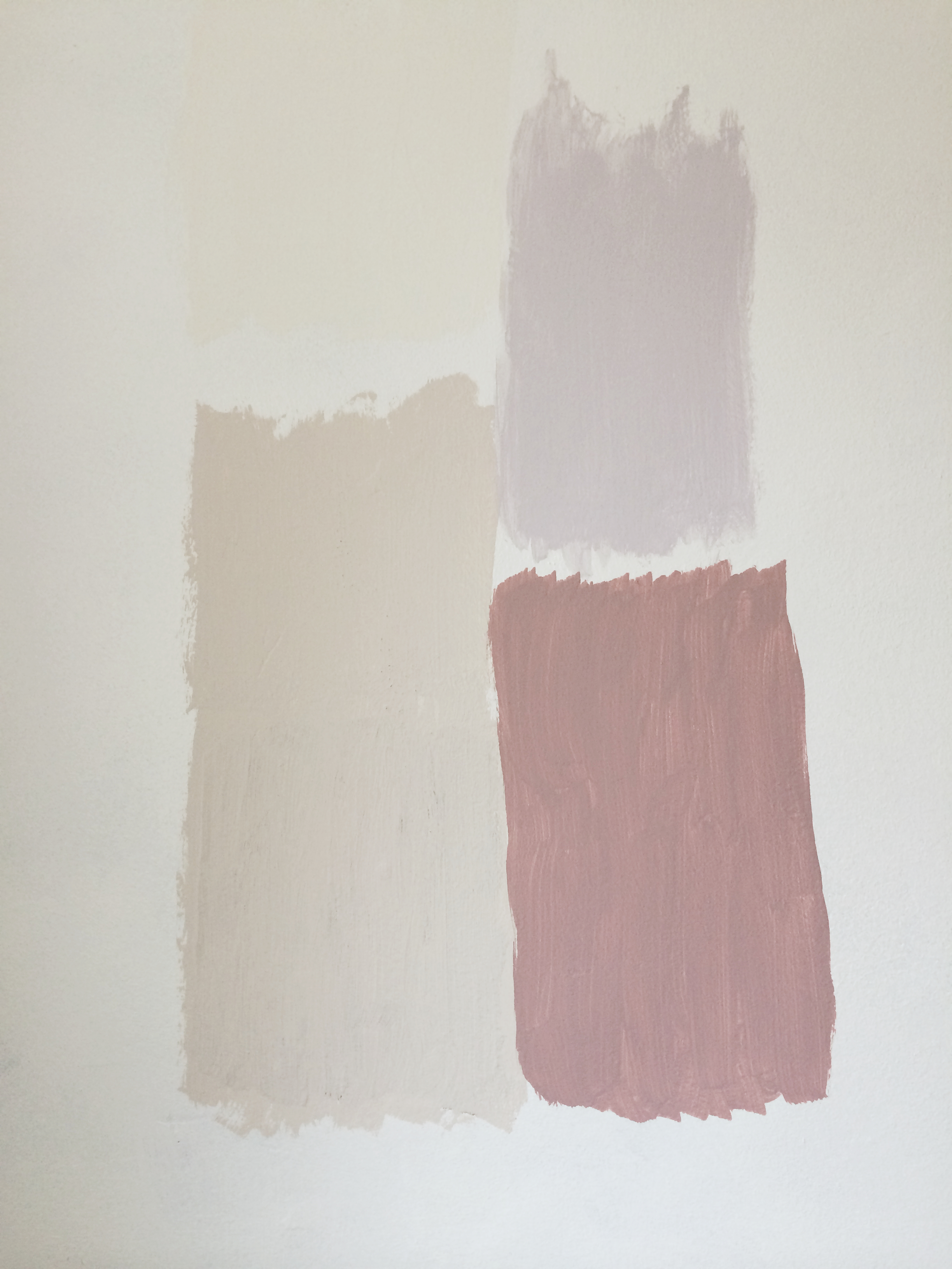
I have tested a million colours so far. OK, I’ve tested, um, 9 colours. Which is probably 5 too many.
I wanted to keep a common thread through all of the downstairs, so it flows from one room to the next. It’s a small house (have I mentioned that yet?) so I think keeping everything the same main colour would link the rooms rather than making it feel like a run of very small rooms.
I’m really into grey. I’ve seen beautiful images of softest, powdery greys looking cosy and welcoming. Dark, moody bluey-greys looking dramatic and setting off any object you put near it.
So I tried pale, soft greys. Easy to live with, they’re acceptable in every room, from living room to bathroom. But the living room is dark and feels poky. Even a pale colour isn’t going to make it feel light and airy. There’s only one window and it gets very little direct light. Upstairs the same size room but with two windows feels airy and spacious, so we know it’s a problem of light, not physical size. So, working on the premise that you should go with what you’ve got, I decided to go ‘cosy’ in the living room, and stick to my pale greys everywhere else. I went back to those dark and dramatic colour schemes I remembered from Houzz and Pinterest. And then I convinced booyaa it would work.
When I tried what I thought would be the perfect warm, multi-tonal grey I was so disappointed. It looked drab and flat. I tried a dusty purple which I thought might be like our bedroom and look grey with purple undertones. Nope. Mid-tone rather than dark grey? Muddy. Eventually I tried some darker ‘clean’ greys. I thought a grey with a warm tone would work better than a bluish grey in our cold, dark living room. But that was my mistake. The dark, moody, steely grey looks beautiful. Very chic, not the least note of muddy. And bold, I’ll wager, once it’s on a full wall. It could also shrink the room even more, which will be, um, challenging. Oh the antici….pation.
Then there was the conundrum of the woodwork and how to move from one room to another. Can I get away with bringing the skirting board colour right through the downstairs as a way of keeping a link? But what do you do in the hallway, where two rooms come together. You can’t stop painting halfway through an architrave. GAH. How do people cope with this? It feels like I’m playing KerPlunk. One false move and it all falls apart.
It’ll be a few weeks before we get painted but I’ll post pics as soon as it’s all done. (I should have put the video here, right?)